Click below to download the PSD template with live text to edit with all the effects applied to the layer.
The font I’ve used in the file is Pacifico, which you can download from Font Squirrel.
Below is a tutorial run through of how I did it.
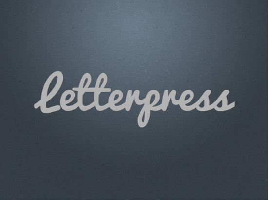
Letterpress effect in Photoshop
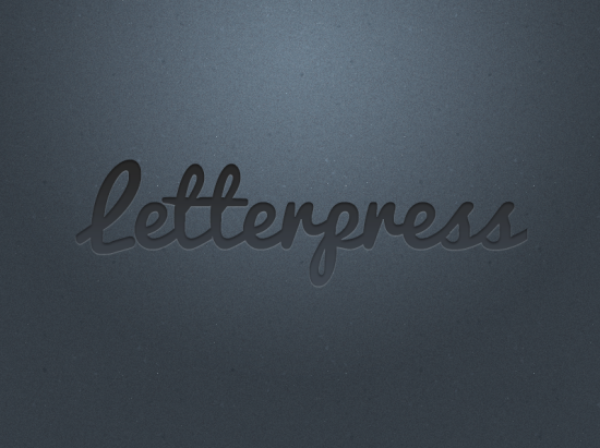
1. Create you word you want to letterpress. In my case Letterpress (original, I know!)
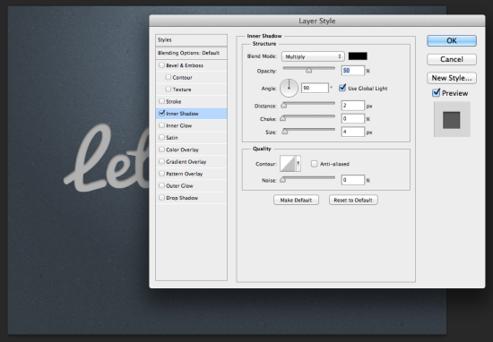
2. Add a INNER SHADOW to the text layer.
Blend mode needs to be MULTIPLY at 50% Black.
Angle 90.
Distance 2px and Size 4px
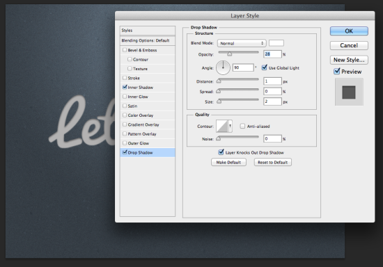
3. Now add a DROP SHADOW to the same text layer with the settings:
Blend mode set to NORMAL at 28% white.
Angle 90.
Distance 1px and Size 2px.
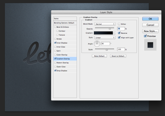
4. Last thing to do is add a GRADIENT OVERLAY to again the same text layer.
Blend mode NORMAL at 78% Opacity.
Set the GRADIENT from Black to Dark Grey.
Style to Linear, which it should be set to by default.
Angle 90 and Scale 100%.
And hopefully you should end up with something like this!
NICE
Ian thanks for sharing this technique! I employed it for the first time today. Novice at this: I used 2 lines of text and found the lower line, using the same settings, always appears “lighter” and “raised” when compared to the upper line. (see sample, attached)
Is that by design, and should I figure out different settings for multiple lines of text?
I think I bumbled my way into a fix: I changed the base text color of the 2nd line, which made the end effect match the top line of text.
I think if you duplicate the top layer so that the gradient isn’t going over both lines, that may help.
Could i have one question please. Which font you can use here.
Very useful tutorial about Photoshop man. Every part you showed in a very nice way, especially images are very useful here. And best part in here is in a short express lots of thing. Excellent presentation man.
your using font is really awesome.Thanks for sharing the tutorial which will help me to create one.
Nice your created the letter press effect . Well made and it a educative post there is no doubt so i’m thinking its will more useful post beginners .